So you want to move to …?
Finding (Pareto) optimal neighborhoods in NYC
Introduction
Finding a place to live is never easy, this is especially true in a mega-city like New York. The options seem endless, and different trade-offs need to be considered when hunting for apartments: Do I want to live closer to my workplace but pay a higher rent, or do I possibly want to move to a quieter residential neighborhood sacrificing valuable time during my commute?
When it comes to choosing the right place to live, every individual will have different priorities, so there is no “one size fits all” solution. In terms of formal decision-making theory, this problem can be cast as a multi-objective or Pareto optimization. As the name suggests, rather than optimizing a variable (in this case the neighborhood) to minimize a single cost-function (i.e. rent) one wants to simultaneously optimize several cost-functions. While not entirely accurate in the mathematical sense I will refer to these cost-functions loosely as metrics in the remainder of this report and will specify the metrics used in the following section.
The goal of this report will be to find Pareto efficient (PE) (aka Pareto optimal) NYC Neighborhoods. The easiest way to understand Pareto efficiency is in terms of a negative example: Let us assume we want to find a neighborhood that is both cheap and safe. The metrics are therefore median rent and crime rate. If a neighborhood is not Pareto efficient, we can always find a different neighborhood that improves at least one of the metrics while not impairing any other ones. Conversely, if this is not possible, the neighborhood is called Pareto efficient.
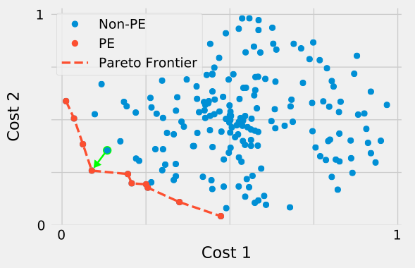
Figure 1. Pareto efficiency for synthetic dataset. The point highlighted in green is not PE as both Cost 1 and Cost 2 can be decreased by moving along the path indicated by the arrow.
The benefits of this approach are clear, as simply finding the “best” neighborhood would require one to specify the relative importance of rent and crime rate. This relative importance, however, is highly subjective and will differ from person to person. Pareto efficiency serves as an objective tool to help the apartment-seeker find their best fit. Based on their personal preferences, they can go through the list of PE neighborhoods and choose the one closest to their liking. It should be noted that, from an optimization standpoint, it does not make sense to pick a non-PE neighborhood.
Data
The metrics and associated data used in this report are the following
-
Safety
To calculate the average safety of a given neighborhood I will combine data on the number of arrests made and the number of shootings. Both datasets are availabe at NYC Open Data. Ideally the crime rate would be normalized by the population of a neighborhoood. Unfortunately, census data was not readily availabe on a NYC neighborhood level, and data that was available was both outdated and rather coarse-grained. I have therefore chosen to normalize crime rate by the area of a given neighborhood. While not ideal, the area can serve as a proxy for population counts.
-
Rent
To gauge rent prices in every neighborhood, I decided to analyze the median rent for a one bedroom apartment. The data was obtained from StreetEasy
-
Venue Density
Using the Foursquare API, in particular the “explore” endpoint, one can estimate the venue density in a given neighborhood. I will define venue density as the number of venues returned by Foursquare in a 500m radius around the neighborhood center.
-
Distance from Subway
Combining location data on subway entrances with NYC geodata one can determine the average distance to the closest subway entrance for each neighborhood.
-
Distance from Midtown
Given the shorter commute time, it might be desirable for some people to live as close as possible to their workplace. Both, the Financial District, Midtown Manhattan are the centers of economic activity in New York. I have chosen the latter to calculate this distance metric.
Datasets only cover the year of 2019. Due to the lack of data regarding Staten Island, I disregarded the borough in the final analysis.
Methods
NYC Open Data queries
Where possible, I obtained data from NYC Open Data through their SODA API. This API allows for filtering, querying and aggregating data using a syntax reminiscient of SQL. For example to obtain data on all shootings that occured in 2019 one would use the following request:
https://data.cityofnewyork.us/resource/833y-fsy8.json?$where=occur_date between '2019-01-01T00:00:00.000' and '2019-12-31T00:00:00.000' limit 1000000
Safety
To calculate the safety metric I combined data on arrests and shootings.
| Type | Total number in 2019 |
|---|---|
| Arrests | 214617 |
| Shootings | 1716 |
Along with the location where the incident occured, the arrests data contained information about the type of felony/misdemeanor that was observed.
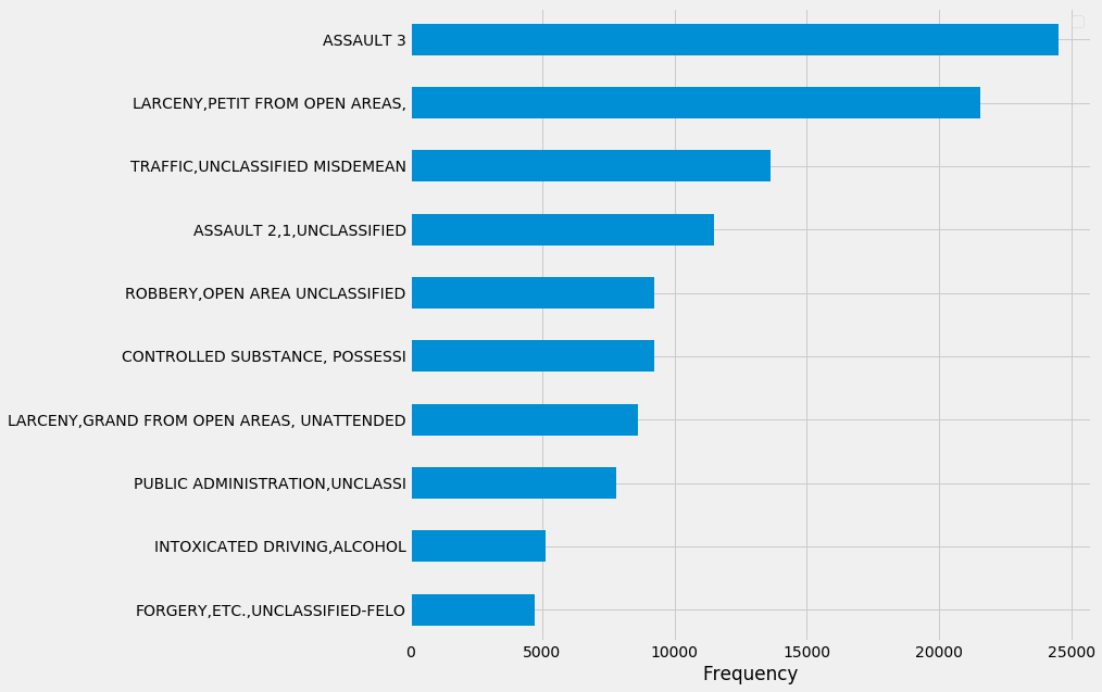
Using a geometric algorithm (ray-casting) I determined which neighborhoods the incidents, both in the case of arrests and shootings, occured in.
To get an accurate treatment of distances, the coordinates provided as longitude and latitude first had to be multiplied by appropriate prefactors as so:
This linear approximation to distances on a sphere works well for the small angles we are interested in.
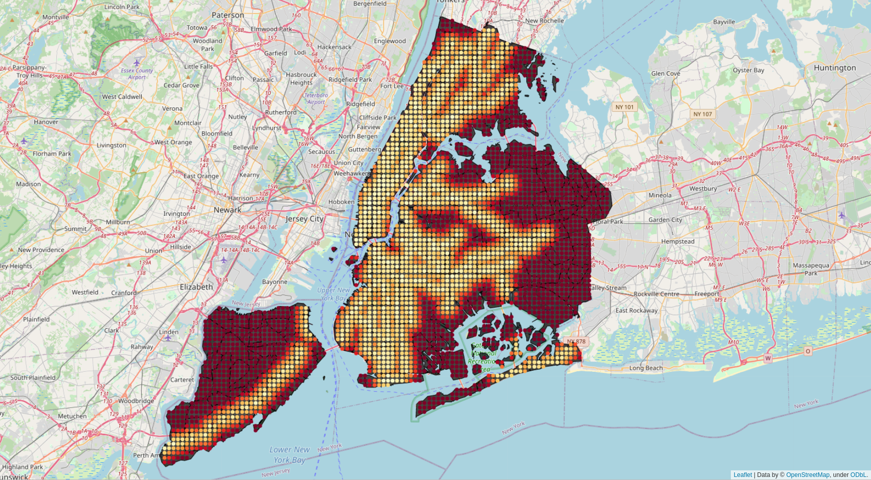
I expressed incident counts for each neighborhood as multiples of the average amount of incidents in all of NYC and normalized them by the neighborhood area. I then combined together data on arrests and shootings. As the normalization occured before the datasets were combined, more weight was automatically given to shootings. The final metric for safety is expressed as a multiple of the crime rate across all of NYC. The following map shows this metric on a log-2 scale:
Rent
Obtaining rent data was challenging as no complete, openly avalaible datasets were obtainable online. The following data from StreetEasy proved to be the most comprehensive, but many neighborhoods are still missing as indicated by the black areas:
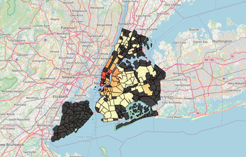
I decided to fill in the gaps with a predictive model. At this point I also made the decision to disregard Staten Island in the final analysis as data was simply not sufficient to draw reliable conclusions regarding this borough.
Several ideas come to mind when trying to build a predictive model for rent prices. An important factor that determines rent prices is certainly location. One can therefore expect that a k-nearest-neighbor regression model will be able to predict rent prices by using information about adjacent neighborhoods.
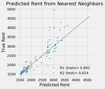
The model clearly becomes less reliable in regions of high rent and performs reasonably well in the 1500 to 2500 dollar regime.
Another approach is to predict rent prices from past sales prices. This is possible as we can assume that both are correlated. Moreover sales prices are available for many neighborhoods for which rent prices are not. The data was fitted using Ridge Regression with Polynomial Features up to order 2.
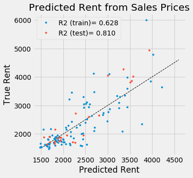
The $R^2$ metric indicates that this model performes better than the one using nearest neighbors. However, sales data is not available for every neighborhood, so the final model will need to be able to take into account other kinds of input as well.
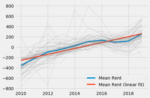
For some neighborhoods where rent prices for 2019 are missing, historic prices are still available. For these neighborhoods one can simply model the average increase in rent over the years to get an estimate of current rent prices. Note that rent prices were shifted to zero mean.
Among the three models introduced above, only the KNN algorithm can be used for every neighborhood, as both historic data as well as sales data is incomplete. However, it seems that valuable information is contained in those datasets, so we should make use of them wherever possible. The solution to this is to build an ensemble model that takes the predicted prices from the above models as input and outputs one combined price. As model, I used a Random Forest Regressor for its ability to handle missing data. To simulate missing historic and sales data I applied a random mask to both training and test input.
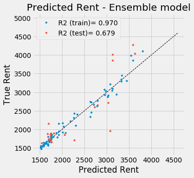
The model performs better than the nearest neighbor regressor by itself, and due to the way it was fitted, can be applied to neighborhoods where historic and sales data is either present, partially complete or completely missing.
Finally using the ensemble estimator, I can impute missing rent prices into the original dataset:
Using my domain knowledge as a NYC resident, I can affirm that none of the imputed prices seem non-sensical.
Venue Density
Venue density in a given neighborhood was estimated as the amount of venues returned by the Foursquare API in a 500m radius around the neighborhood center.
Distance from Subway
To calculate the average distance to the closest subway station for every neighborhood I generated a regular grid across NYC. For every grid point, I determined the distance to the closest subway station. Using a ray casting algorithm, I determined whether a given grid point was inside the polygon spanned by the neighborhood borders.
Averaging over grid points in every neighborhood I create the “Distance from Subway” metric.
Distance from Midtown
As a proxy for “Distance from Midtown”, I calculated the distance between every (geometric) neighborhood center and Times Square.
Results
For visualization purposes, I will start by only considering the Pareto frontier for a subset of the metrics introduced above. The following graphic shows neighborhoods that are Pareto optimal with respect to rent, crime rate and average rent.
Using all five metrics metioned in the “Data” section, one can measure the relative amount of Pareto optimal neighborhoods by borough:
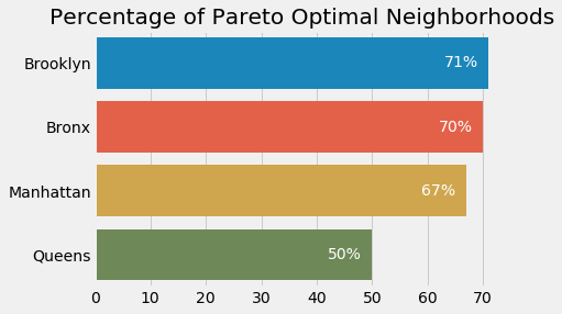
The clear winners are Brooklyn and the Bronx, followed by Manhattan and Queens in last place.
What is every boroughs strongest asset? Looking only at Pareto optimal neighborhoods, one can calculate average value for every metric. For visualization purposes, I have normalized every metric to lie between zero and one, with zero being “worst” and one meaning “best”.
Not surprisingly, Manhattan is a clear winner when it comes to venue density and distance to Midtown (which, of course, is in Manhattan). With its many residential neighborhoods in the East, Queens can be considered the safest borough (not everywhere!) followed by Brooklyn. Anyone who lives in the Bronx can attest to its unbeatable rent prices. In terms of safety, the Bronx ties with Manhattan.
Discussion
Using a combination of five different metrics and datasets from various sources, I have identified Pareto optimal neighborhoods in New York City.
Of course, many factors contribute to an individual’s decision where to live and my set of metrics is certainly far from exhaustive. Possible other factors that could be included in a more detailed or personalized analysis are: Proximity to one’s workplace, proximity to parks/beaches, noise level, air pollution, quality of public schools and many more.
Nevertheless, my analysis will hopefully help apartment seekers find their ideal neighborhood. Maybe I can even convince people already living in NYC to upgrade their living situation by moving from a non-PE to a PE neighborhood.
I have created a small web-app that, given a NYC neighborhood it will determine whether it is PE and if not recommend PE alternatives. Give it a try: (the app might take a moment to spin up as it is currently hosted on a free Heroku instance)